Example: Analysis of Variance
Environmental Data Analysis, Spring 2024
4/2/2024
Learning goals
- Fit an analysis of variance (ANOVA) model in R
- Assess the fit of the data to model assumptions
- Adjust the model as needed/explore alternative options
- Correctly interpret the output from an ANOVA
Background
To explore one-way ANOVA, we will examine an example relating to nutritional variability in carrot varieties, Leja et al. 2013. In this study, the researchers grew 35 genetic lines of carrots in field trials in Poland. The genetic lines included carrots of five different colors - white, yellow, orange, red, and purple. They then measured the concentrations of phenolics and ‘radical scavenging activity’ - a measure of antioxidant activity.
The question guiding our example is:
Do carrot colors differ in phenolic content?
Preliminaries: Load libraries + data
library(tidyverse)
library(agricolae) # this is for running Tukey test to determine post-hoc differences
library(rstatix) # this helps with Games Howell test for post-hoc diffs (after Welch)
library(multcompView) # this helps to generate a compact letter display for Games-Howell

leja <- read.csv("./data/Leja_2013_data.csv")
str(leja)
'data.frame': 35 obs. of 15 variables:
$ color : chr "White" "White" "White" "White" ...
$ variety : chr "Blanche 1/2 longue des vosges" "Kuettiger" "Mestnaya" "White Belgian" ...
$ type : chr "W" "W" "E" "W" ...
$ phenols_fc : num 16.8 14 29.4 19 10.8 10.5 14.3 21.1 43.6 24.6 ...
$ phenols_fc_se : num 0.7 0.7 2.5 1.1 1.3 0.8 0.9 0.5 1.4 1.6 ...
$ phenols_uv : num 23.4 22.8 33.5 21.4 19.8 29 30.6 35.1 42.2 36.1 ...
$ phenols_uv_se : num 2.1 0.7 3.4 1.4 1.2 1 2.9 1.7 2 3.4 ...
$ phenyl.propanoids : num 5.3 4.5 7.6 5.2 4.3 6 6 7.6 9.5 7.3 ...
$ phenyl.propanoids_se: num 0.5 0.1 0.8 0.3 0.3 0.3 0.7 0.4 0.6 0.8 ...
$ flavonols : num 3.4 3.4 4.5 3.3 2.8 4.7 5.2 5.5 6.7 5.3 ...
$ flavonols_se : num 0.4 0.1 0.5 0.3 0.2 0.2 0.5 0.3 0.3 0.6 ...
$ anthocyanins : num 0.2 0.2 0.3 0.2 0.1 0.4 0.4 0.4 0.5 0.4 ...
$ anthocyanins_se : num 0.03 0 0.03 0.04 0.02 0.04 0.05 0.04 0.02 0.05 ...
$ RSA : num 5.4 3.6 10.6 6.8 3.7 3.6 3.8 5.7 8.6 6.3 ...
$ RSA_se : num 0.6 0.4 0.4 1.3 0.4 0.8 1.5 0.6 0.8 0.9 ...The dataset Leja_2013_data.csv contains 15 variables
from Table 1 in the paper. The ones that are relevant to our questions
are:
color: Carrot color at maturityvariety: Carrot variety name (= genetic line)phenols_uv: Phenolic content in mg per 100 g fresh weight
In this example, color is the independent variable and
phenols_uv is the dependent variable. Each row in the
dataset corresponds to one variety.
Part 1: Preliminary data checking
# Do we have an equal number of varieties in each color group?
table(leja$color)
Orange Purple    Red  White Yellow
    15      2      5      5      8
# convert color into a factor for analysis
leja$color <- factor(leja$color)# Use ggplot to create a boxplot to visualize the relationship between the two variables, putting the independent variable on the x axis and the dependent on the y axis
ggplot(data = leja, aes(x = color, y = phenols_uv)) +
geom_boxplot() 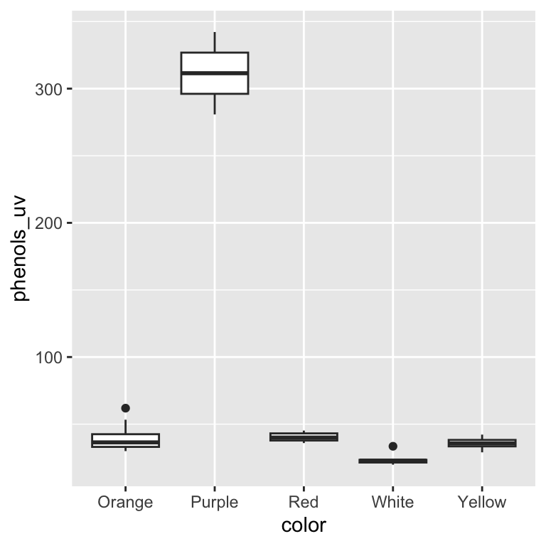
| Version | Author | Date |
|---|---|---|
| d29b13d | maggiedouglas | 2024-04-02 |
# Let's also check the distribution of the Y variable...
ggplot(data = leja, aes(x = phenols_uv)) +
  geom_density()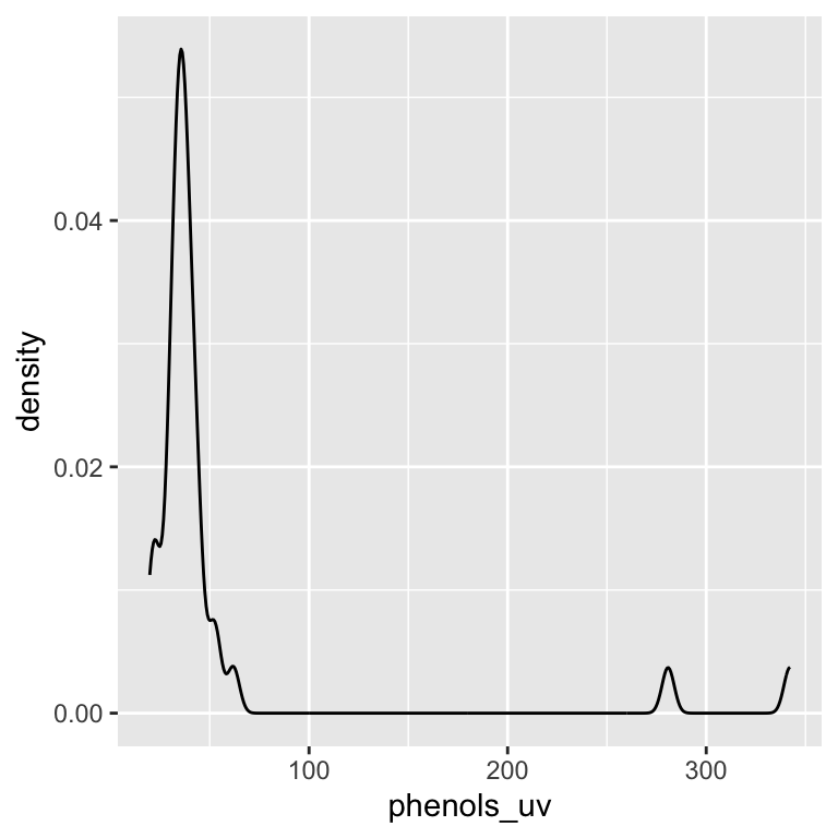
| Version | Author | Date |
|---|---|---|
| d29b13d | maggiedouglas | 2024-04-02 |
We can see that we have unequal sample sizes among groups (ranging from 2 varieties for purple carrots to 15 varieties for orange). We can also see that purple carrots appear to have much higher phenolics and the overall the distribution of phenolic content is quite skewed. It will be important to keep these patterns in mind as we continue…
Part 2: Fit ANOVA
Use the function aov() to fit an ANOVA model of phenolic
content or RSA as a function of color or variety. The function requires
the following arguments:
- formula: a description of the model to be fitted (form: y ~ x)
- data: the name of the data frame containing the variables in the formula
mod <- aov(phenols_uv ~ color, data = leja)Part 3: Check assumptions + fit
Remember that linear regression has four assumptions:
- Independence: Data points are independent of each other
- Normality: Within each group, Y is normally distributed
- Equal variance: The variance of Y is equal for all groups
The first assumption relates to the way the data were collected. The data were generated from a replicated plot experiment, so it is appropriate to assume that each data point is independent.
We can use the code below to generate diagnostic plots to assess the next two assumptions. These graphs show the distributions of the residuals in a number of different ways. (residuals = difference between each point and the line/predicted value)
# Generate diagnostic plots
par(mfrow = c(2,2))
plot(mod)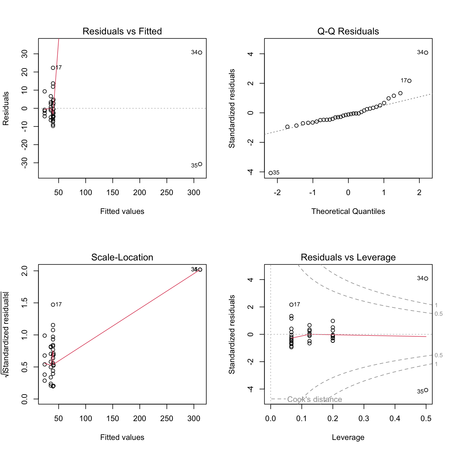
| Version | Author | Date |
|---|---|---|
| d29b13d | maggiedouglas | 2024-04-02 |
# Check distribution of the residuals
hist(mod$residuals)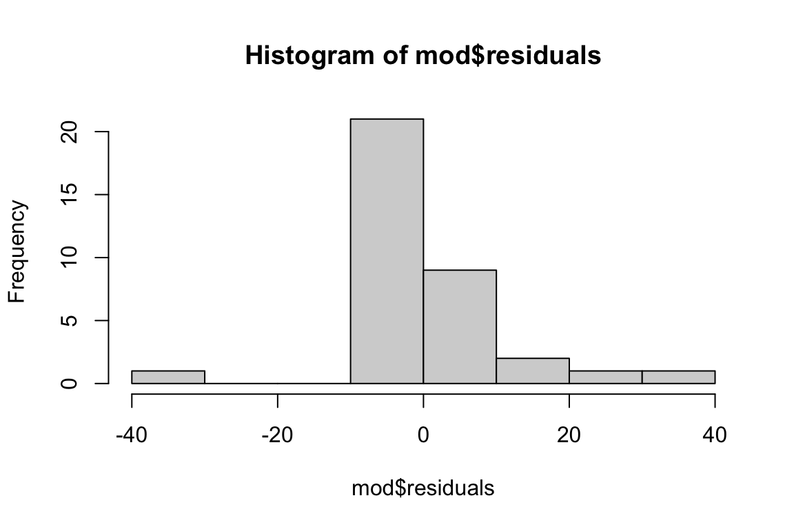
| Version | Author | Date |
|---|---|---|
| d29b13d | maggiedouglas | 2024-04-02 |
# Check for equal variance between groups
boxplot(mod$residuals ~ leja$color)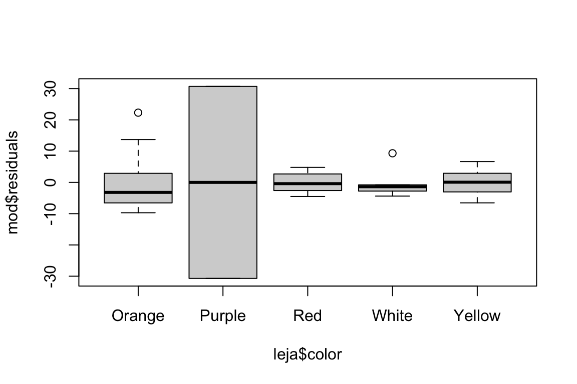
| Version | Author | Date |
|---|---|---|
| d29b13d | maggiedouglas | 2024-04-02 |
Part 4: Adjust the model
Option 1: If residuals are not normal, try a transformation…
The distribution of residuals seems borderline non-normal, and we are definitely violating the equal variance assumption. Would a transformation help?
leja$log_phenols <- log(leja$phenols_uv)

mod_log <- aov(log_phenols ~ color, data = leja)
# Generate diagnostic plots
par(mfrow = c(2,2))
plot(mod_log)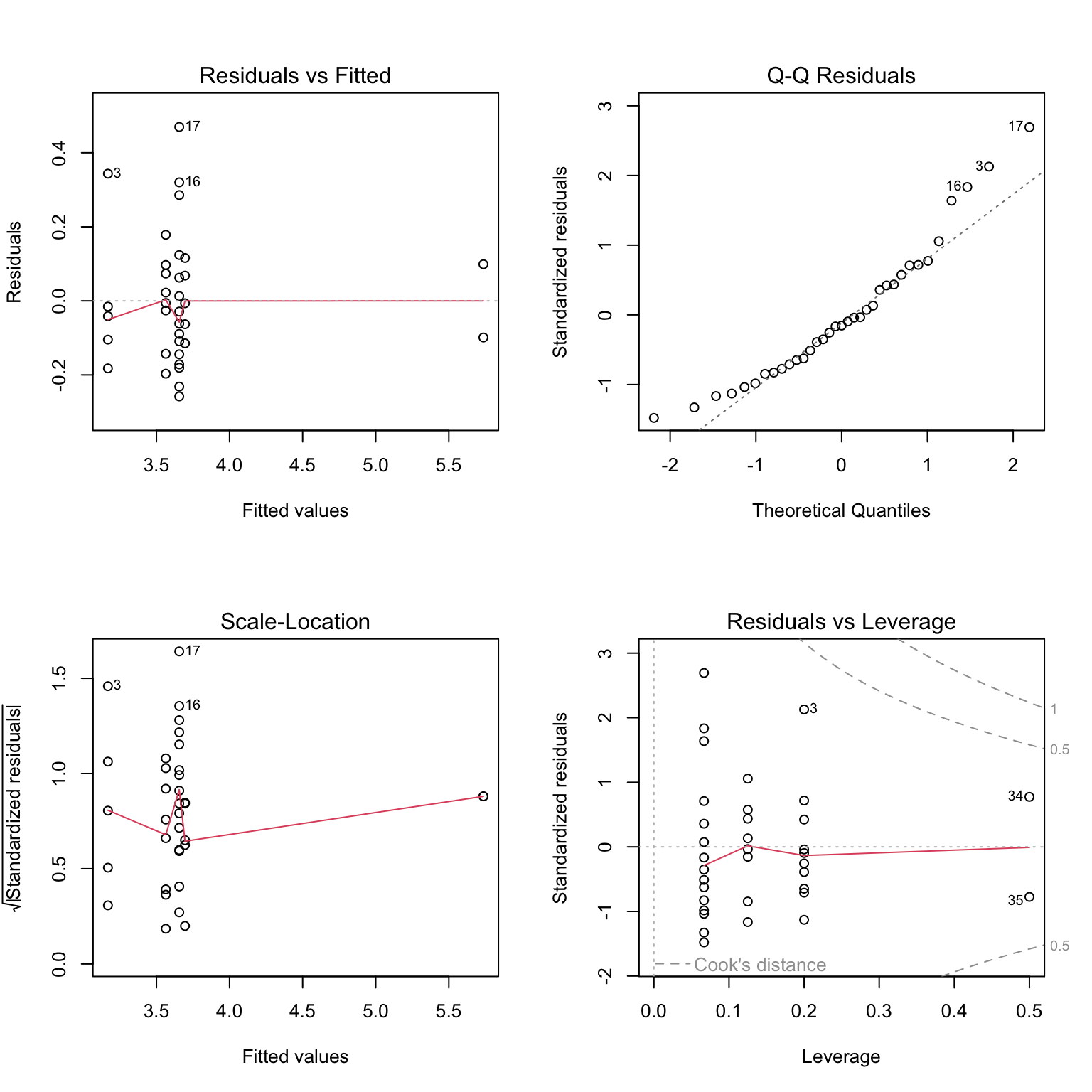
| Version | Author | Date |
|---|---|---|
| d29b13d | maggiedouglas | 2024-04-02 |
# Check distribution of the residuals
hist(mod_log$residuals)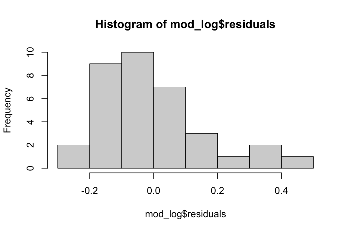
| Version | Author | Date |
|---|---|---|
| d29b13d | maggiedouglas | 2024-04-02 |
# Check for equal variance between groups
boxplot(mod_log$residuals ~ leja$color)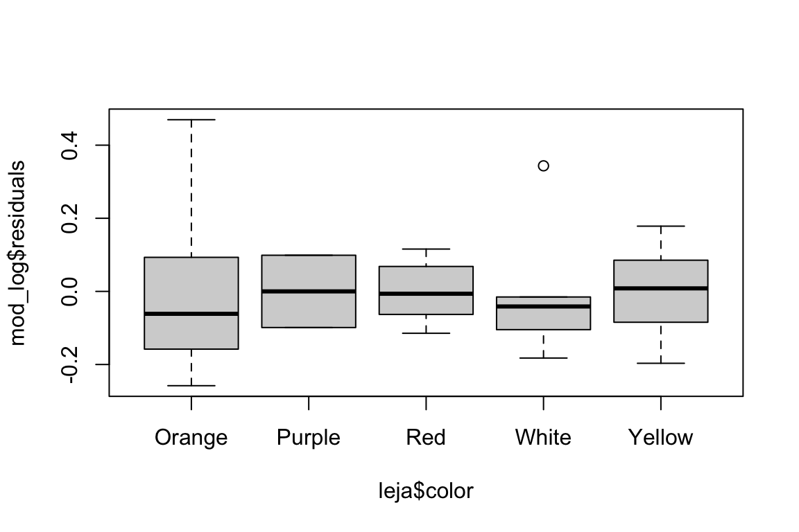
| Version | Author | Date |
|---|---|---|
| d29b13d | maggiedouglas | 2024-04-02 |
Option 2: If variance is unequal, use an alternative test…
If the normality assumption was okay in the original model, and the unequal variance was the main issue, we could use a Welch’s ANOVA as an alternative. Welch’s ANOVA still assumes normality, but does not assume equal variance.
# Welch's ANOVA
mod_welch <- oneway.test(phenols_uv ~ color, data = leja, var.equal = FALSE)
Option 3: If residuals are non-normal AND variance is unequal…
Start with a transformation. Often transforming the data for normality will also improve fit to the equality of variance assumption.
If you try a transformation and the residuals are still strongly non-normal, consult Prof. D for options…
Part 5: Interpret outcomes
Now we will generate the ANOVA table for our analysis. Typically I would recommend only generating and interpreting the outcomes from whatever you think is the ‘best’ model. Here I will show you both standard and Welch’s ANOVA so you have an example if you need it.
Standard ANOVA
# For model object from standard ANOVA w/ transformed Y
summary(mod_log)
Df Sum Sq Mean Sq F value Pr(>F)
color 4 9.883 2.4709 75.83 3.02e-15 ***
Residuals 30 0.978 0.0326
---
Signif. codes: 0 '***' 0.001 '**' 0.01 '*' 0.05 '.' 0.1 ' ' 1# standard ANOVA (Tukey HSD) on model with transformed Y
HSD.test(mod_log, "color", group = TRUE, console = TRUE, unbalanced = TRUE)
Study: mod_log ~ "color"

HSD Test for log_phenols

Mean Square Error:  0.03258487

color,  means

       log_phenols        std  r         se      Min      Max      Q25      Q50
Orange    3.655857 0.21574690 15 0.04660820 3.397858 4.125520 3.497929 3.594569
Purple    5.736519 0.13983227  2 0.12764182 5.637643 5.835395 5.687081 5.736519
Red       3.695309 0.09380436  5 0.08072778 3.580737 3.811097 3.632309 3.688879
White     3.168023 0.20257103  5 0.08072778 2.985682 3.511545 3.063391 3.126761
Yellow    3.563981 0.12363643  8 0.06382091 3.367296 3.742420 3.508792 3.572247
            Q75
Orange 3.749036
Purple 5.785957
Red    3.763523
White  3.152736
Yellow 3.643438

Alpha: 0.05 ; DF Error: 30
Critical Value of Studentized Range: 4.102079

Groups according to probability of means differences and alpha level( 0.05 )

Treatments with the same letter are not significantly different.

       log_phenols groups
Purple    5.736519      a
Red       3.695309      b
Orange    3.655857      b
Yellow    3.563981      b
White     3.168023      c
# Since we fit the model on transformed data, it is helpful to back-transform for interpretation
# The inverse of the natural log is the exponential function
exp(5.74) # back-transformed mean for purple carrots[1] 311.0644exp(3.6) # rough back-transformed mean for red/orange/yellow carrots[1] 36.59823Standard ANOVA results summary: Phenolic content of carrots differed significantly by color (ANOVA with log transformation, F4,30 = 75.8, P < 0.001). A post-hoc comparison using Tukey HSD revealed that purple varieties were significantly greater in phenolic content that all other colors. Red, orange, and yellow carrot varieties were also richer in phenolics than white carrot varieties. The back-transformed means suggest that purple carrot varieties have roughly 10 times more phenolics than all other carrot colors.
Welch’s ANOVA
# For Welch's ANOVA, no need to use 'summary' here
mod_welch
    One-way analysis of means (not assuming equal variances)

data:  phenols_uv and color
F = 21.026, num df = 4.0000, denom df = 5.7057, p-value = 0.001412
# Welch's ANOVA (Games-Howell test)
games_howell_test(phenols_uv ~ color, data = leja)Warning: There were 2 warnings in `mutate()`.
The first warning was:
ℹ In argument: `data = map(.data$data, .f, ...)`.
Caused by warning in `stats::ptukey()`:
! NaNs produced
ℹ Run `dplyr::last_dplyr_warnings()` to see the 1 remaining warning.# A tibble: 10 × 8
.y. group1 group2 estimate conf.low conf.high p.adj p.adj.signif
* <chr> <chr> <chr> <dbl> <dbl> <dbl> <dbl> <chr>
1 phenols_uv Orange Purple 272. NaN NaN NaN ""
2 phenols_uv Orange Red 0.800 -8.17 9.77 0.999 "ns"
3 phenols_uv Orange White -15.4 -26.2 -4.62 0.005 "**"
4 phenols_uv Orange Yellow -4.06 -12.6 4.43 0.619 "ns"
5 phenols_uv Purple Red -271. NaN NaN NaN ""
6 phenols_uv Purple White -287. NaN NaN NaN ""
7 phenols_uv Purple Yellow -276. NaN NaN NaN ""
8 phenols_uv Red White -16.2 -26.7 -5.75 0.005 "**"
9 phenols_uv Red Yellow -4.86 -12.4 2.72 0.282 "ns"
10 phenols_uv White Yellow 11.4 1.22 21.5 0.029 "*" # Here is some code to generate a compact letter display like for Tukey HSD!
res <- games_howell_test(phenols_uv ~ color, data = leja) %>% # store results of the Games-Howell as dataframe
mutate(comp = paste0(group1,"-",group2)) %>% # create a new variable for comparison
filter(!is.nan(p.adj)) # remove weird NaN values - not necessary if you don't have these
pValues <- res$p.adj # store vector of P values
dif <- pValues < 0.05 # create logical vector of which P values are significant
names(dif) <- res$comp # store comparison as the row names of the logical vector
multcompLetters(dif) # this function does the heavy lifting on creating groupsOrange Red White Yellow
"a" "a" "b" "a" Welch’s ANOVA results summary: Phenolic content of carrots differed significantly by color (Welch’s ANOVA, F4,5.7 = 21.03, P = 0.001). A post-hoc comparison using the Games-Howell test indicated that yellow, orange, and red varieties have higher phenolic content than white varieties. Purple varieties have the numerically highest phenolic content, >250 mg per 100 g higher than all other colors. The difference between purple and the other colors could not be statistically tested due to there being only two purple varieties in the dataset (limited sample size).
Part 6: Make a final graph
Now that we have our results, we can make a polished graph to summarize our findings. This should be a bar graph with error bars representing +/- 1 standard error. Here too, you should make the final graph that corresponds to your analysis. Here I will show you the options both for raw and transformed data, for reference.
If analysis was on the raw data (i.e. not transformed)
Generate group means and standard errors
summary <- leja %>%
  group_by(color) %>% # group the dataset by color; return one row per color
  summarize(mean = mean(phenols_uv, na.rm = TRUE), # calculate mean of Y
            sd = sd(phenols_uv, na.rm = TRUE), # calculate standard deviation of Y
            n = n()) %>% # calculate sample size in each group
  mutate(se = sd/sqrt(n)) # standard error is SD divided by square root of sample size
Create the graph
Notice that the argument levels() in function
factor() is expecting a vector that lists the values in the
given variable. In this example, because we were analyzing color, the
list is the names of colors. But if you are analyzing varieties, this
would be a list of variety names (exactly as they appear in the
dataset).
Furthermore, the first two lines of code in the chunk are meant to
order the values of color in a sensible order and map appropriate colors
to them. If you are not working with colors, you probably do not need
these two lines of code at all! (and you also would not need
scale_fill_manual() in the plot code)
# Order the levels of color
summary$color <- factor(summary$color, levels = c("White","Yellow","Orange","Red","Purple"))

# set color palette to map onto colors in the dataset
palette <- c("white","yellow","orange","red","purple")

# Create the graph
ggplot(summary, aes(x = color, y = mean, fill = color)) +
  geom_bar(stat = "identity", color = "black", show.legend = FALSE) +
  geom_errorbar(aes(ymin = mean - se, ymax = mean + se), width = 0.2) +
  scale_fill_manual(values = palette) + # use palette to set colors of the graph
  theme_light() +
  xlab("") +
  ylab("Phenols (mg per 100 g)") +
  coord_flip()
If analysis was on the transformed data…
Generate group means and standard errors + back-transform
It is usually a good idea to graph the results in original units to
facilitate interpretation. This requires back-transforming the estimates
based on the log scale back using exp().
summary_trans <- leja %>%
  group_by(color) %>% # group the dataset by color; return one row per color
  summarize(mean = mean(log_phenols, na.rm = TRUE), # calculate mean of Y
            sd = sd(log_phenols, na.rm = TRUE), # calculate standard deviation of Y
            n = n()) %>% # calculate sample size in each group
  mutate(se = sd/sqrt(n),
         lerr = mean - se, # calculate the bound for the lower error bar
         uerr = mean + se, # calculate the bound for the upper error bar
         bt_mean = exp(mean), # take the inverse log on the mean estimate
         bt_lerr = exp(lerr), # take the inverse log on the lower error bar bound
         bt_uerr = exp(uerr)) # take the inverse log on the upper error bar bound
Create the graph
Notice that the argument levels() in function
factor() is expecting a vector that lists the values in the
given variable. In this example, because we were analyzing color, the
list is the names of colors. But if you are analyzing varieties, this
would be a list of variety names (exactly as they appear in the
dataset).
Furthermore, the first two lines of code in the chunk are meant to
order the values of color in a sensible order and map appropriate colors
to them. If you are not working with colors, you probably do not need
these two lines of code at all! (and you also would not need
scale_fill_manual() in the plot code)
# Order the levels of color
summary_trans$color <- factor(summary_trans$color, levels = c("White","Yellow","Orange","Red","Purple"))

# set color palette
palette <- c("white","yellow","orange","red","purple")

# Create the graph
ggplot(summary_trans, aes(x = color, y = bt_mean, fill = color)) +
  geom_bar(stat = "identity", color = "black", show.legend = FALSE) +
  geom_errorbar(aes(ymin = bt_lerr, ymax = bt_uerr), width = 0.2) +
  scale_fill_manual(values = palette) +
  theme_light() +
  xlab("") +
  ylab("Phenols (mg per 100 g)") +
  coord_flip()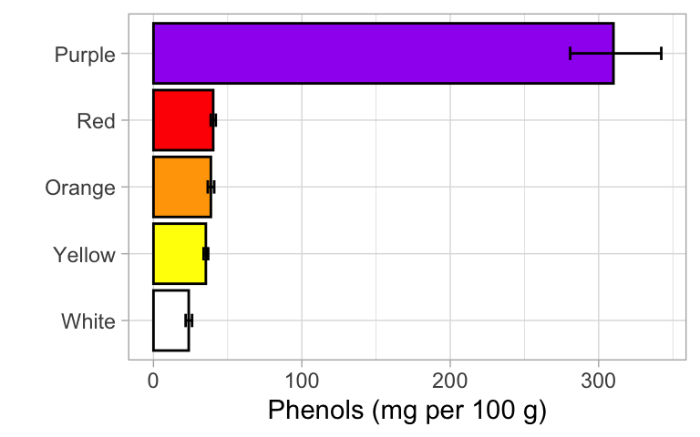
sessionInfo()R version 4.3.2 (2023-10-31)
Platform: x86_64-apple-darwin20 (64-bit)
Running under: macOS Monterey 12.4
Matrix products: default
BLAS: /Library/Frameworks/R.framework/Versions/4.3-x86_64/Resources/lib/libRblas.0.dylib
LAPACK: /Library/Frameworks/R.framework/Versions/4.3-x86_64/Resources/lib/libRlapack.dylib; LAPACK version 3.11.0
locale:
[1] en_US.UTF-8/en_US.UTF-8/en_US.UTF-8/C/en_US.UTF-8/en_US.UTF-8
time zone: America/New_York
tzcode source: internal
attached base packages:
[1] stats graphics grDevices utils datasets methods base
other attached packages:
[1] multcompView_0.1-10 rstatix_0.7.2 agricolae_1.3-7
[4] lubridate_1.9.3 forcats_1.0.0 stringr_1.5.1
[7] dplyr_1.1.4 purrr_1.0.2 readr_2.1.5
[10] tidyr_1.3.0 tibble_3.2.1 ggplot2_3.4.4
[13] tidyverse_2.0.0
loaded via a namespace (and not attached):
[1] gtable_0.3.4 xfun_0.41 bslib_0.6.1 lattice_0.21-9
[5] tzdb_0.4.0 vctrs_0.6.5 tools_4.3.2 generics_0.1.3
[9] fansi_1.0.6 highr_0.10 cluster_2.1.4 AlgDesign_1.2.1
[13] pkgconfig_2.0.3 lifecycle_1.0.4 compiler_4.3.2 farver_2.1.1
[17] git2r_0.33.0 munsell_0.5.0 carData_3.0-5 httpuv_1.6.13
[21] htmltools_0.5.7 sass_0.4.8 yaml_2.3.8 whisker_0.4.1
[25] later_1.3.2 pillar_1.9.0 car_3.1-2 jquerylib_0.1.4
[29] MASS_7.3-60 cachem_1.0.8 abind_1.4-5 nlme_3.1-163
[33] tidyselect_1.2.0 digest_0.6.34 stringi_1.8.3 labeling_0.4.3
[37] rprojroot_2.0.4 fastmap_1.1.1 grid_4.3.2 colorspace_2.1-0
[41] cli_3.6.2 magrittr_2.0.3 utf8_1.2.4 broom_1.0.5
[45] withr_3.0.0 scales_1.3.0 promises_1.2.1 backports_1.4.1
[49] timechange_0.3.0 rmarkdown_2.25 workflowr_1.7.1 hms_1.1.3
[53] evaluate_0.23 knitr_1.45 rlang_1.1.3 Rcpp_1.0.12
[57] glue_1.7.0 rstudioapi_0.15.0 jsonlite_1.8.8 R6_2.5.1
[61] fs_1.6.3